Panels are the containers used to "frame" your visuals in Present and Publish. Depending on the style chosen, your panel may include a title, breadcrumbs, a border, shadowing, and so on. When viewed at runtime in Present, each panel also contains Panel Tools that are shown when hovering over the visual, regardless of whether or not panels are shown or hidden.
The various panel tools can be enabled or disabled as needed using the Runtime Settings dialog.
Show or Hide Panels, Titles, and Subtitles
Show or hide panels (or the title or subtitle shown in the panel) by toggling the Show Panels button the ribbon:
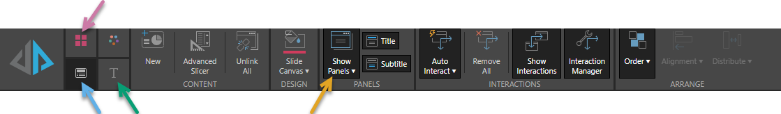
You can show or hide panels at the presentation, slide, or visual level:
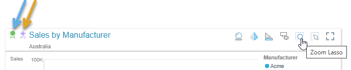
- Presentation Level: Shows or hides panels for all visuals across the presentation. Toggle Show Panels in the Presentation ribbon (purple arrow). Note that you cannot show and hide the title or subtitle from this ribbon, nor is the Show Panels dropdown list available.
- Slide Level: Shows or hides panels, titles, or subtitles for all visuals on the current slide. Toggle Show Panels, Title, or Subtitle on the Slide ribbon (blue arrow). To apply formatting or style changes for all panels on the selected slide, open the Show Panels dropdown list.
- Visual Level: Shows, hides, or formats the panel for one or more selected visuals, use Show Panels from the Component ribbon (green arrow).
Show Panels dropdown list
The Show Panels dropdown list features:
- A list of panel style presets to choose from. For details, see Preset panel styles below.
- A link offering More Panel Options. Select More Panel Options to open the Formatting Panel and customize the appearance at a more granular level. For details of Panel Formatting options, see Panel Settings in Present Pro.
Preset panel styles
Panel styles can be applied at the slide or visualization level from the Show Panels dropdown list. The following panel styles are available:
 Classic
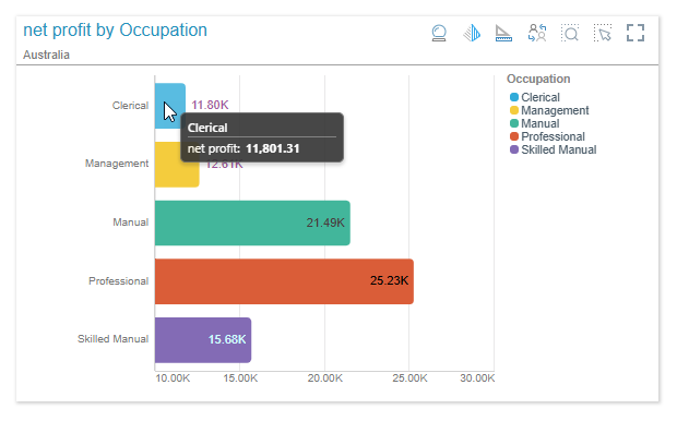
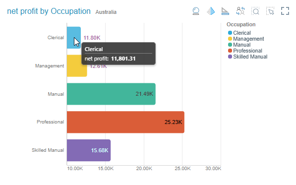
The Classic panel features square corners and a shadow around the edges, as well as a dividing line beneath the title. The title appears at the top left corner, and the panel tools appear at the top right when hovering over the visual.
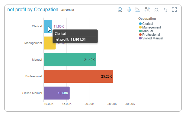
Rounded
The Rounded panel features rounded corners and a black outline. The title appears at the top left corner, and the panel tools appear at the top right when hovering over the visual.
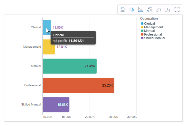
Minimal
The Minimal panel features square corners and a shadow all around the edges. The title is hidden, and the panel tools appear as a pop-up above the visual when hovering over it.
Tiled
The Tiled panel is totally flattened; there is no outline or shadow. The title appears at the top left corner, and the panel tools appear at the top right when hovering over the visual.
Off / Hidden
When the panel is turned off, the title is hidden and the panel tools appear as a pop-up above the visual when hovering over it.
Model Marking
The following "marks" may be shown in the panels when viewed at runtime:
Tip: Hover your cursor over the icons to show a tooltip.
Sanctioned Model
The Sanctioned Model certificate (blue arrow above) is displayed on visuals built from a data model that has been marked as "Sanctioned" by the Admin. Visuals built from a sanctioned data model display the sanctioned model mark at the top-left.
Note: The Sanctioned Model feature is not available in the Community Edition.
AI-Generated
The AI-Generated icon (orange arrow above) is displayed on visuals built from a data model that has been marked as generated from an "AI-Generated Data Source" by the Admin. Visuals built from a data model that uses AI display the AI-Generated model mark at the top-left. For more details, see Identify AI-Generated Data Sources.
Panel Settings
To improve the appearance and readability of your presentations and publications, you can change the formatting of the panels (or "frames") that contain each of your visuals. These formatting options determine the panel's general look and feel (shadow, title font, and so on) as well as the formatting of its title and subtitle. In Present only, the style also specifies the appearance of the panel tools that are available at runtime. For details of Panel Formatting options, see Panel Settings in Present Pro.
Legend Panels
If you've added a legend as a separate visual (a standalone legend), you can customize its panel separately from the visual it is associated with.
When editing the formatting options for a legend, you can change the General and Title settings. For more information, see Panel Settings in Present Pro.
